International Film Festival Responive Website
Film festivals are fun. But they feature many films the average festival-goer hasn’t heard of.
My Film Festival website aims to connect people to the films uniquely suited to their taste and enhance the festival experience along the way.
Project Overview
The Problem: Choosing films at a film festival can be difficult. Most films are unknown to the average festival-goer. And they seek to optimize their choices.
The Goal: Reduce the “Paradox of choice” people feel when choosing films to watch.
*learn more about Barry Schwarz’s psychological concept called “Paradox of Choice” here.
My Role: UX Designer leading the Indie Film Festival responsive website design
Responsibilities: Conducting Interviews, Paper and digital wireframing, low and high-fidelity prototyping, conducting usability studies, accounting for accessibility, iterating on designs and responsive designs.
2. Understanding Users
User Research Summary
I conducted user interviews, which I then converted into affinity maps to better understand what users really coveted from the Film Festival experience. I came away with two primary discoveries in my research.
First, that many users consider the process of choosing to attend film screenings a stressful decision. By and large, that’s because most users can only see so many films. They really wanted assistance to confidently choose films that may be best suited to them and their schedule.
Second, users wanted to feel empowered. They feel like attending a festival is a big deal. And they wanted to make informed award nominations, while feeling like their contribution made a difference.
User Pain Points
Decision Fatigue
Many users feel like choosing which film screenings to attend is difficult, especially when they’re limited in time and are choosing from a selection of mostly unknown films.
Experience
Many users wanted to enhance the enhance the festival experience by attending special events and feeling like they’re apart of a community.
Informed Nominations
Users want to feel empowered to make significant contributions to awards by being better informed.
“I want help choosing the films that are most relevant to me.”
- The Film Hobbyist
My research revealed one primary user profile: The Film Hobbyist
The Film Hobbyist really loves exploring new films. But because filmmaking isn’t their career, there’s a lot they may not know about the films being featured at a film festival. They may not be familiar with certain directors or actors. Themes and styles prevalent in particular countries or subgenres may be unknown to them.
To make the most out of their festival-going experience, they need decision support to find the films they are most likely to find rewarding.
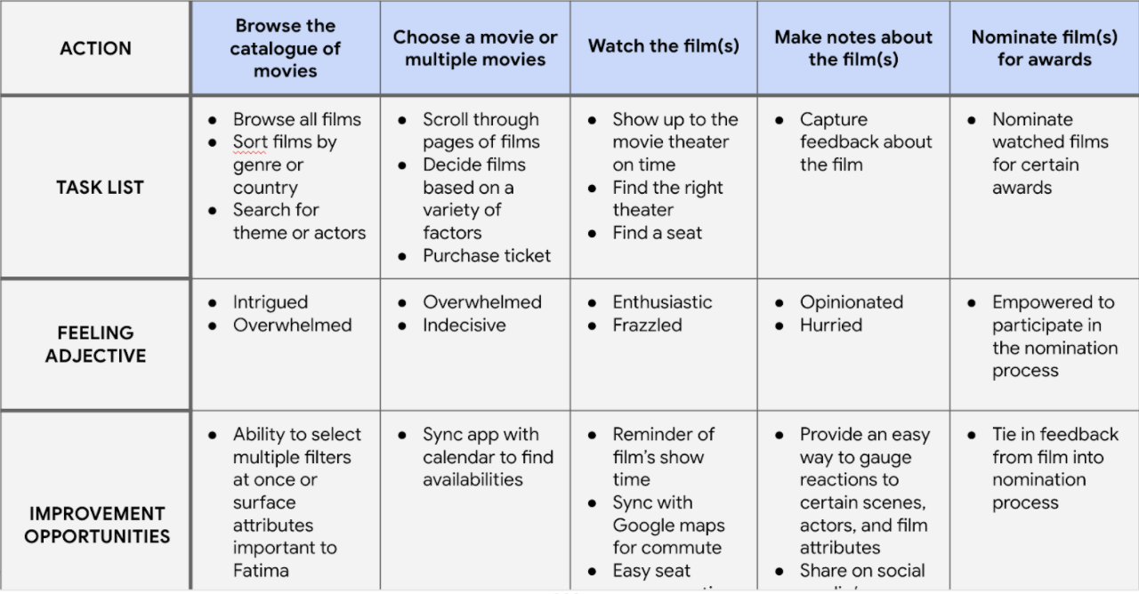
User Journey Map
I created a user journey map based on The Film Hobbyist’s imagined experience to help identify possible pain points.
3. Starting the Design
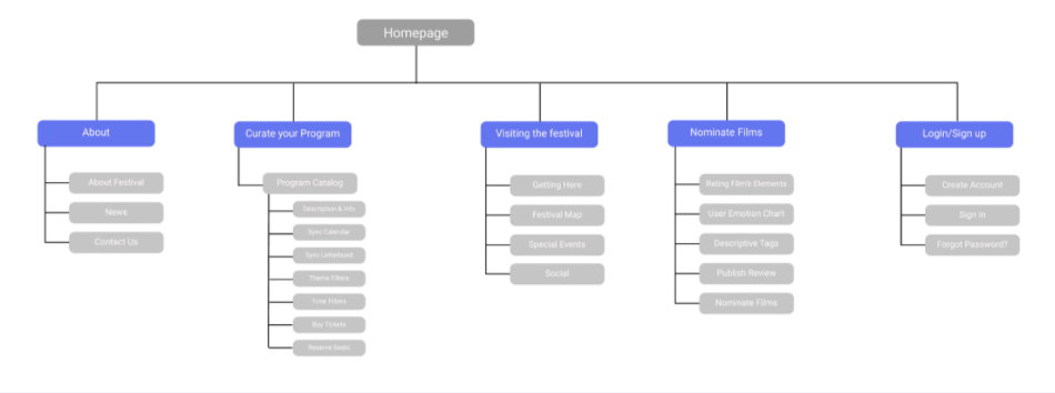
Sitemap
Using user research, I created a site map to outline the information architecture that could assist a user’s festival-going experience.
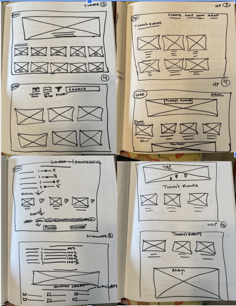
Paper Wireframes
Next, I sketched out paper wireframes for each screen in the app, keeping user pain points about navigation, browsing, and nomination flow in mind.
The two left-most wireframes depict how the decision assistants and nomination flows may be enhanced.
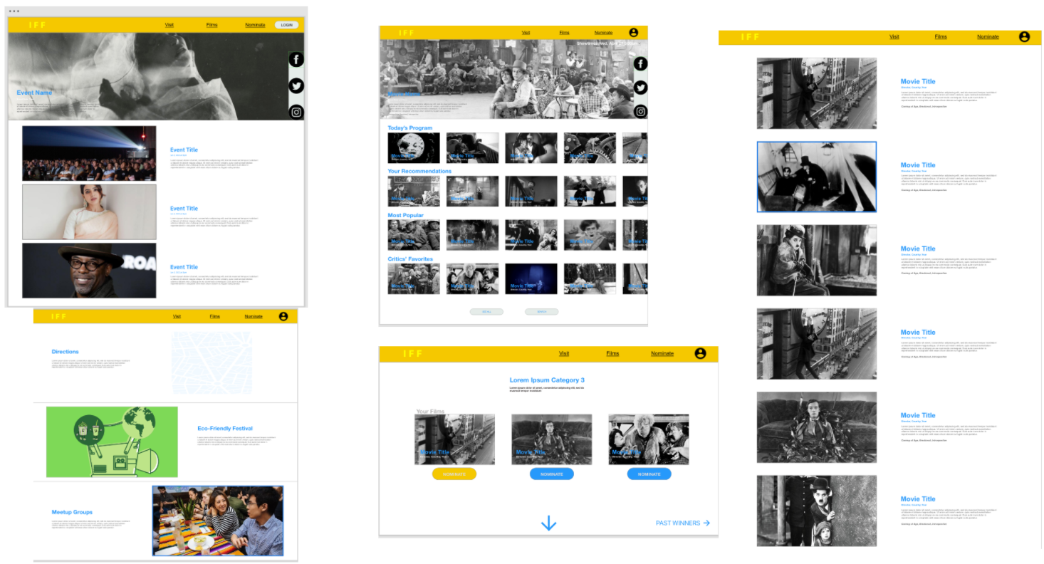
Digital Wireframes
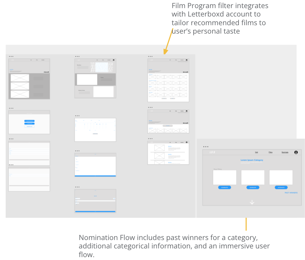
Moving from paper to digital wireframes meant bringing to life some of the designed elements that may solve user’s main pain points.
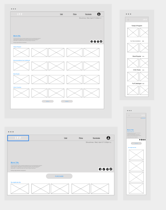
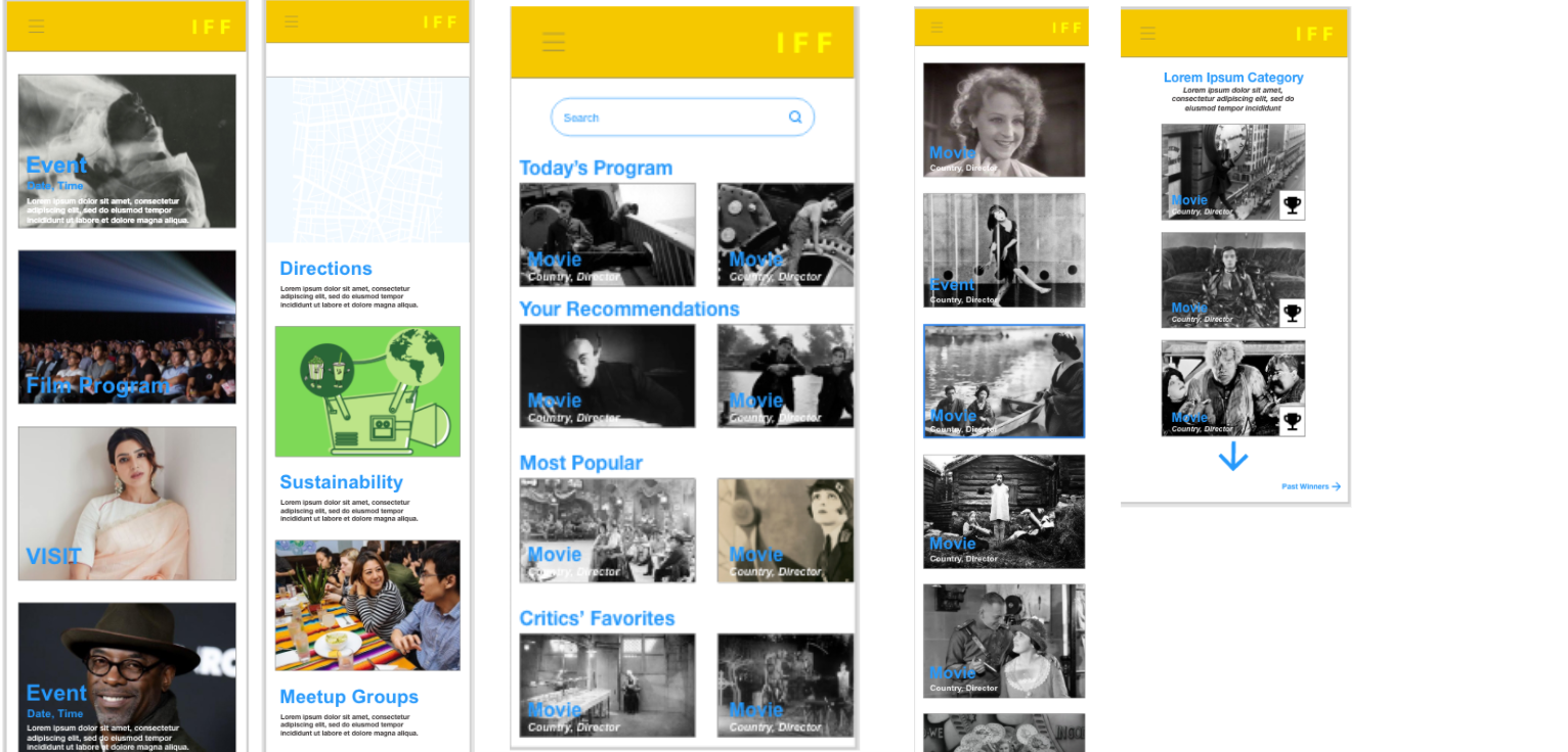
Digital Wireframes Screen Size Variations
Variations between the desktop experience and the mobile experience show how information has been condensed while maintaining the same architecture as the desktop experience.
Low-Fidelity Prototype
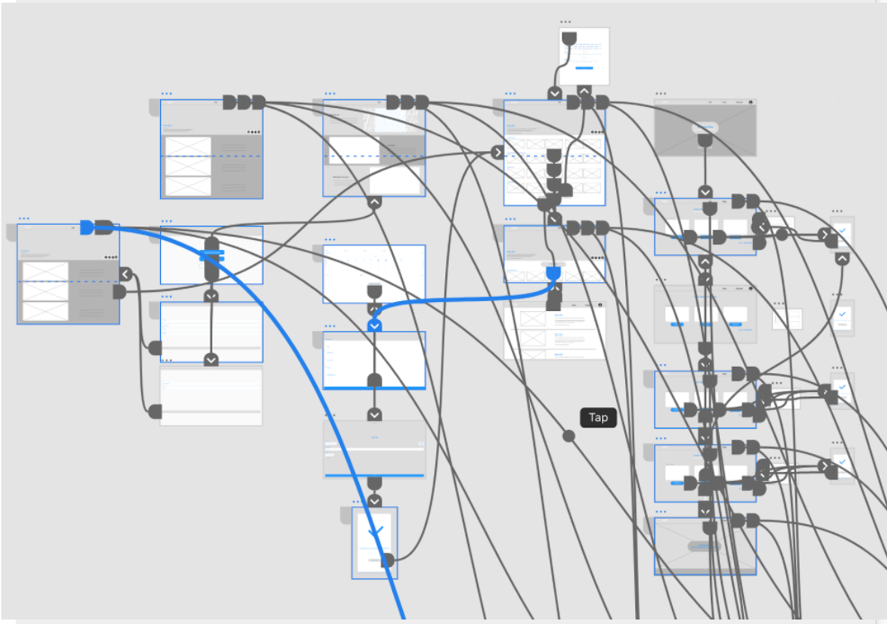
At this point, I’ve created low-fidelity prototypes by connecting all relevant screens that embody the primary user flow.
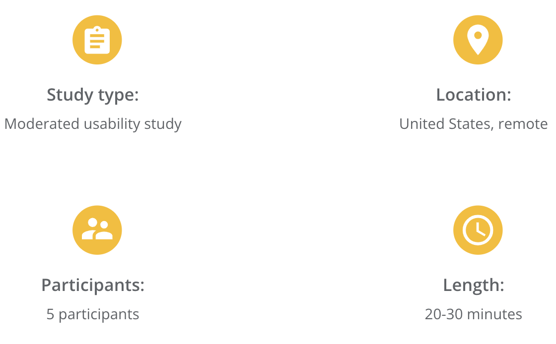
Usability Study Parameters
Then I conducted a usability study to test my low-fidelity prototype.
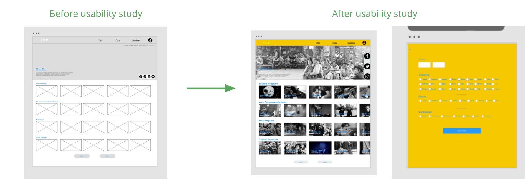
Usability Study Findings
Better Decision Assistance
Upon scanning the film program, users didn’t have a robust enough set of filters to select films they wanted to see.
Nomination Flow
By and large, users felt confused and overwhelmed by the nomination flow.
Confusion between “Visits” and “Events”
Users were confused by the terms “Visit” and “Events” as well as the content on their respective pages
4. Refining the Design
Mockups
Based on insights from the usability study, I made enhancements to the film program filters, like including a more robust filter set with date range.
I also improved the nomination flow by adding more instruction on what’s expected of the user, as well as more information about past winners and the category they would be nominating for.
Mockup Original Desktop Screen Size
Mockup Mobile Responsive
High-Fidelity Prototype
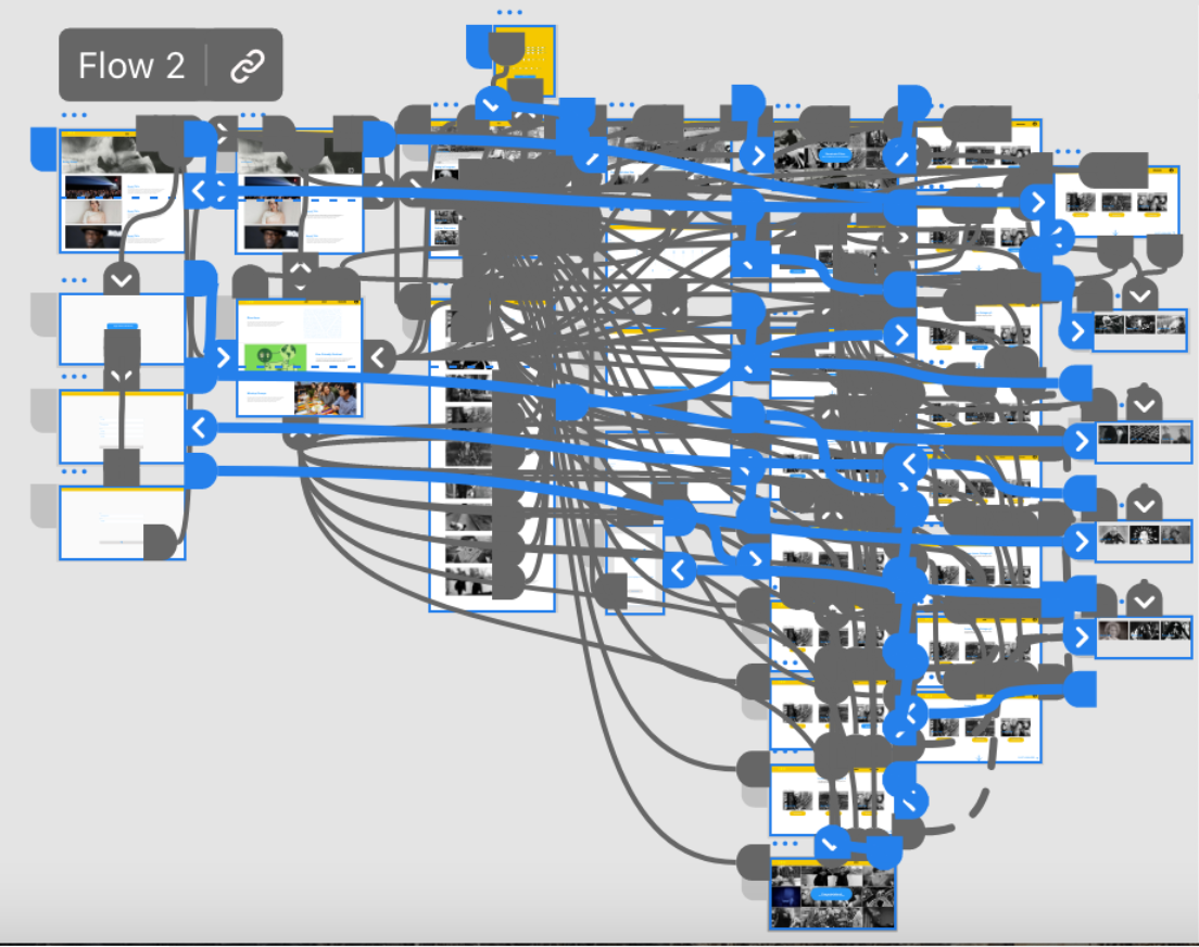
The high-fidelity prototype follows a similar user flow as the low-fidelity prototype but with new enhancements drawn from Usability study research.
The prototype includes a large number of interactions due to the variability of user choice in their decision tree.
Accessibility Considerations
Headings
I inserted headings with subtext for clear visual hierarchy.
Iconography
I used clear icons to help users navigate the site.
WCAG
I consulted WCAG standards for my color and font choices.
5. Going Forward
Takeaways
Impact
Target users shared that the UX flow was intuitive and helpful to reduce the stress level of an film festival experience, in particular the film program’s decision assistant.
What I Learned
I learned that users covet a variety of choices as well as guidance in their decision-making. Thus, it was critical to present the festival’s wide array of film screenings, while also assisting users in narrowing down their choices.
Next Steps
Meetup Group. Include a meetup group on the navigation page to allow festival-goers to meet each other before and after screenings.
Usability Testing Round 2. Conduct follow-up usability testing on high-fidelity prototype for further iteration.
Enhancement. Through the second round of usability testing, identify a short list of improvements that can be made before going live!
