Art Galleries are a mixed bag. For some, they can be
Inspiring. Evocative. And Moving.
For others, they can be
Intimidating. Embarrassing. And kinda stuffy.
That’s why I designed Art Gallery Scavenger Hunt
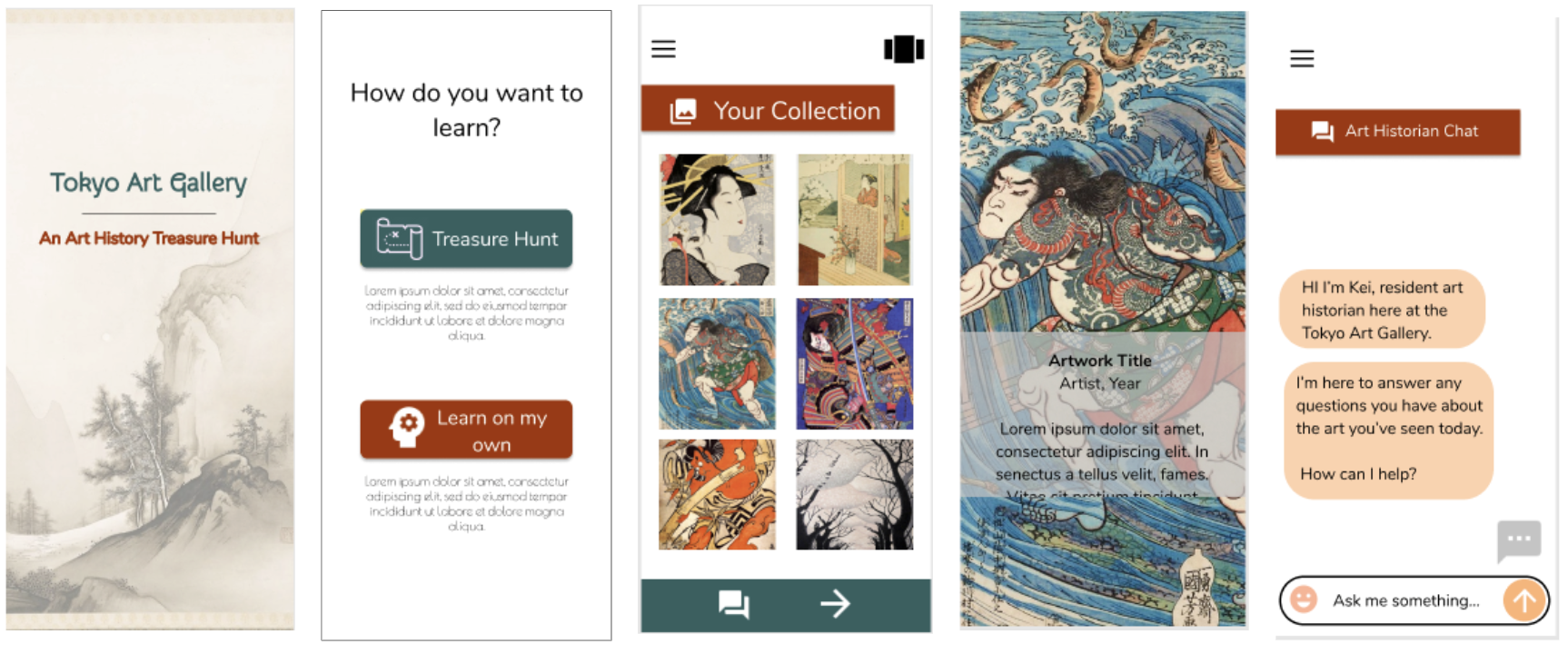
A mobile app that makes learning about art joyful. And seeks to connect everyone to meaningful work.
Project Overview
The Problem:
Art history can be intimidating for many people. It often feels inaccessible, which can discourage guests from attending art galleries and from making meaningful connections with art.
The Goal:
To design a mobile app that eliminates the intimidation factor surrounding art history, and instead bring joy to art education, while driving more guests to an art gallery.
My Role:
UX Designer, responsible for all tasks from conception to delivery.
Software used: Figma and Miro
Responsibilities:
Conducting UX Research, paper and digital wireframing, low and high-fidelity prototyping, conducting usability studies, accounting for accessibility, and iterating on designs.
2. Understanding Users
User Research Summary
I conducted interviews and created empathy maps to better understand my users and their needs. I focused on interviewing users who don’t have a background in art history, and attempted to interview users with different socio-economic backgrounds.
When brainstorming what to build, I assumed that user research would suggest I build a ticket purchasing app with some ability to view art. Instead, I learned that the primary problems users face aren’t functional, but educational and emotional. Users feel discouraged to attend art galleries because they feel intimidated and excluded from art galleries due to the academic nature of art history.
User Pain Points
Intimidation
Users often feel intimidated by art galleries. This can discourage them from going in the first place, preventing interactions with art they may love, and stifling ticket sales for the gallery.
Overwhelmed
Users feel overwhelmed by the amount of artwork and information consumed in an art gallery. This can make the art-going experiences stressful and unenjoyable.
Memory
Users have a difficult time remembering what they’ve learned in an art gallery. This can make the art-going experience feel unrewarding.
“I would love to spend more time at art galleries, but I usually don’t know much about the art. And of course I assume everyone else does. It makes me feel a little silly being there.”
My user research revealed one primary user profile: The Casual Learner.
The casual learner can easily feel excluded from art galleries when surrounded by people who have studied art and who use vocabulary they don’t quite understand. And reading blurbs of text often found next to a work of art is unlikely to engage them.
Alternatively, the casual learner would love to learn more about art, and visit art galleries more often, just so long as the learning is accessible and enjoyable.
User Journey Map
Mapping a typical experience at an art gallery for The Casual Learner helped me understand the wide range of emotions they’re likely to feel during a short visit.
3. Starting the Design
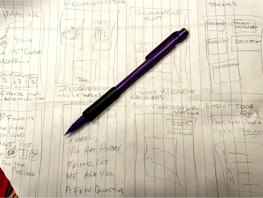
Paper Wireframes
Drafting ideas on paper helped me brainstorm solutions to the identified problems with an open mind.
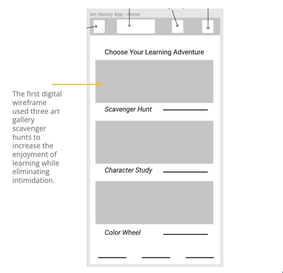
Digital Wireframes
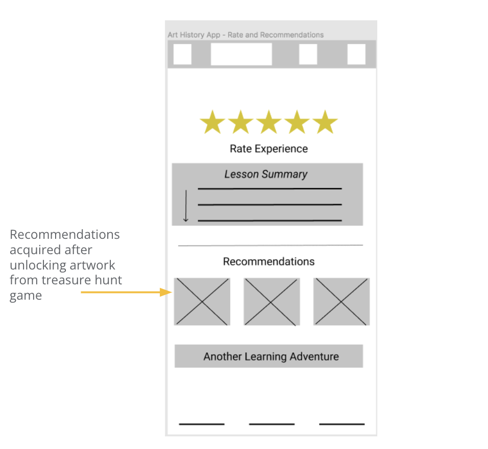
In my first digital wireframe, I used the concept of scavenger hunts to improve the art-going experience. Offering recommendations of similar art was key to making users feel rewarded for playing the treasure hunt game.
Low-Fidelity Prototype
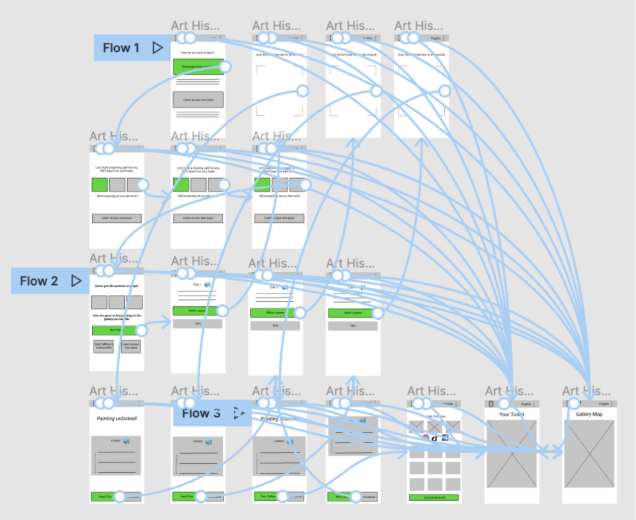
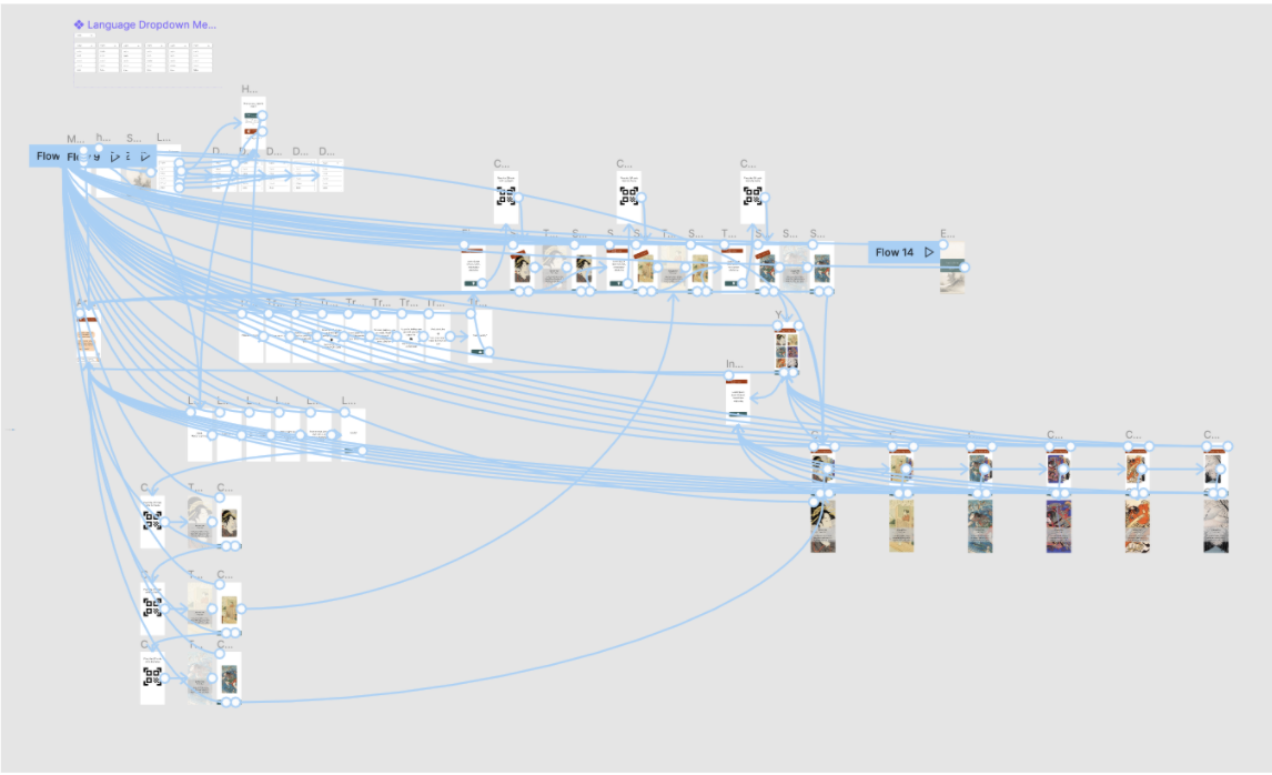
This low-fidelity prototype mapped out the foundation of the user flow for the treasure hunt learning experience.
Usability Study
I conducted two rounds of usability studies. Findings from the first study helped guide the designs from wireframes to mockups. The second study used a high-fidelity prototype and revealed what aspects of the mockups needed refining.
4. Refining the Design
Mockups
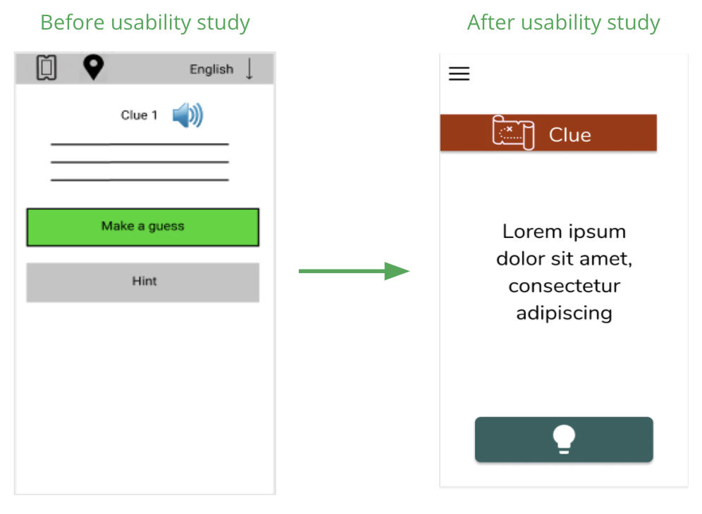
The earlier designs maintained the simplicity of the treasure hunt game, where users are given clues and allowed to make a guess. After the usability study, I learned that there was an opportunity to make the design simpler by consolidating options in a hamburger menu, removing a “hint” option, the text-based lesson, and by making the call-to-action (“guess” button) stand out.
Mockups
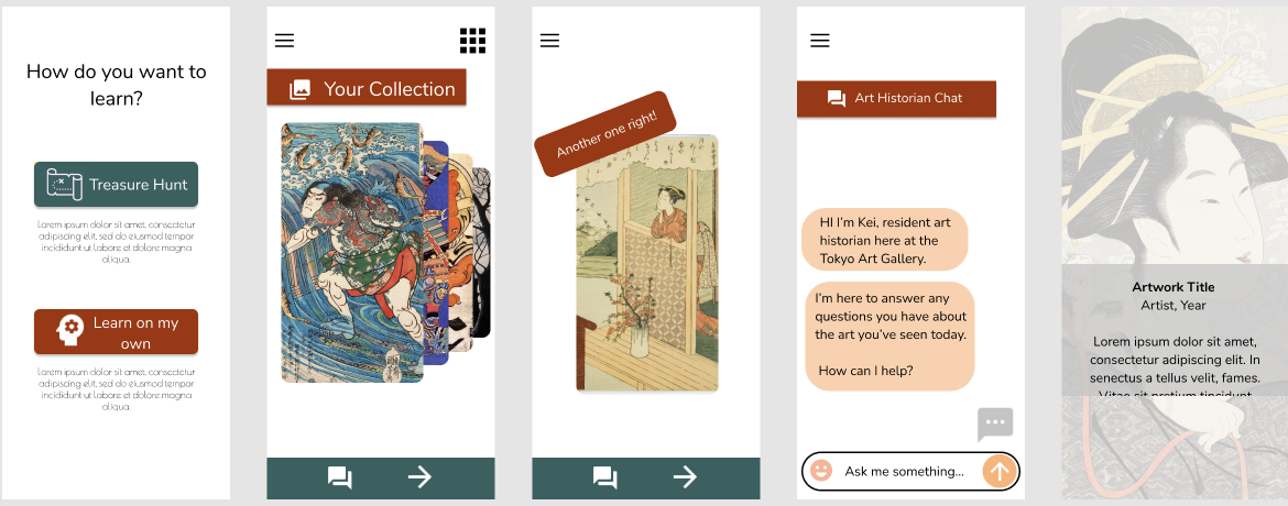
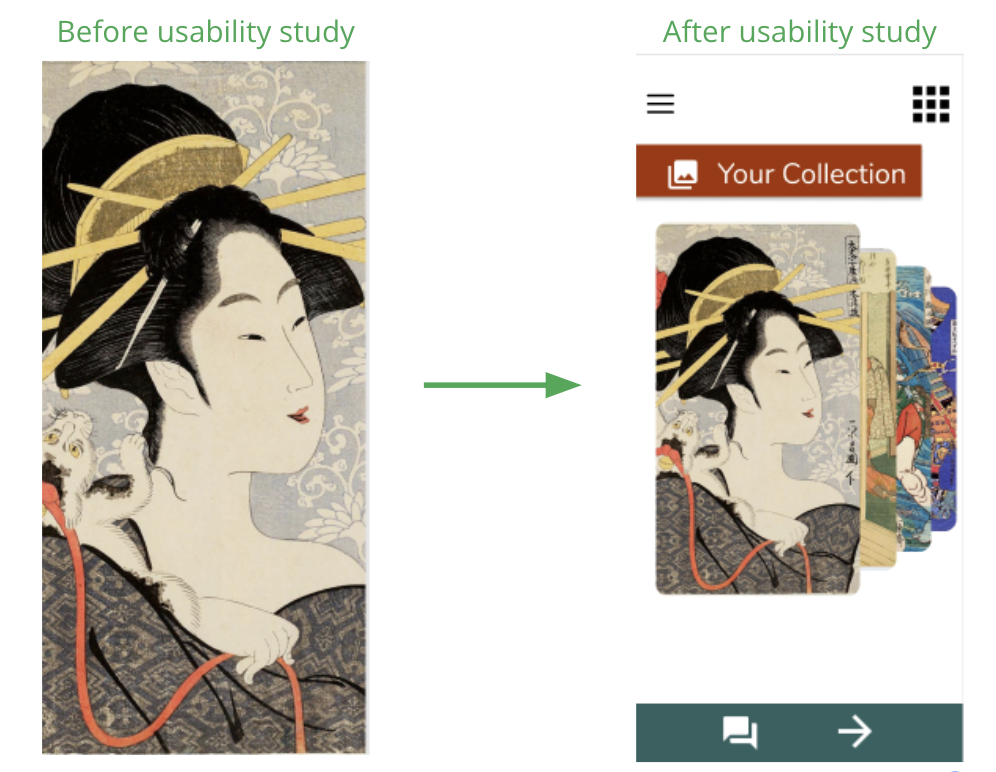
The second usability study revealed confusion around “favoriting” art work in a collection and navigating within a collection. Thus, my next iteration simplifies this by entering all acquired paintings in the user’s collection with elegant “card-flipping” navigation.
Key Mockups
High-Fidelity Prototype
The final high fidelity prototype presents more elegant, and simpler, user flows within the Treasure Hunt game, and in Learn On Your Own mode.
Accessibility Considerations
-
Iconography
I favored icons over text for easier navigation.
-
Color Palette
I swapped original, harsher color scheme in exchange for colors that are approved for accessibility.
-
Screen Reader
App will be screen-reader accessible, allows people with impaired vision to hear text spoken back to them.
5. Going Forward
Key Takeaways
Impact: The scavenger hunt app should help enhance any user’s experience in an art gallery, regardless of their background knowledge in art history. I expect it to drive more guests through the door while ultimately helping people connect with art that moves them.
What I learned: I learned in this process that, if you listen, users will tell what to build. They may not say it directly, but in my initial UX Research, I expected to build a ticket-buying app for an art gallery in Tokyo. Instead, I learned that the core problem users faced had to do with learning, not doing. And the result is this educational companion app.
Next Steps
-
Refine
Refine high-fidelity prototype with a few minor, stylistic changes.
-
More Usability Testing
Conduct more usability testing to determine if any other changes to design must be done.
-
Critical Content
Insert Treasure Hunt game content (clues, lessons, and artwork information).
